
If you would like to offer any of my tutorials to your groups or classes, please contact me first. Please list the name of your group or class, and your website if you have one. Thanks so much!
If you like my Paint Shop Pro tutorials, be sure to take a peek at my new tutorials at Debbie T Designs. Learn how to build your own web site with free tutorials for xhtml and css!
|
|
1. Begin with a 500 x 250 transparent canvas. Save as a .psp image.
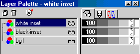
2. Let's get our layers organized. Double click Layer 1 on the Layer Palette and rename it "bg1" - Add two new layers, named "white inset" and "black inset". The newly added layers should be on top of the bg1 layer and white inset should be the topmost layer. (If you need more help with layers, check out my tutorial.)
3. While on the bg1 layer, click the Flood Fill tool ![]() and fill with a pattern or textured solid color of your choice.
It is best to use medium colors and the pattern should not be too busy. (If
you need more information on how the color palette works, try my tutorial.)
I am using a pink textured file.
and fill with a pattern or textured solid color of your choice.
It is best to use medium colors and the pattern should not be too busy. (If
you need more information on how the color palette works, try my tutorial.)
I am using a pink textured file.
You can choose a pattern from the PSP pre-installed pattern menu. If you want to create this for your website, fill with the file you are using for your background. Open the file and it will appear at the top of the menu list when you choose a pattern. Here is a zipped file of the pattern I used.
4. Click on the white inset layer, and let's add some text.
Using the Text tool ![]() ,
click once at the left side of your canvas. The Text Editor will appear. You
might have to experiment with which fonts work the best. I found tall medium
width fonts worked for me, like Franklin Gothic Medium - Make sure
you have NULL as the choice for stroke color. It will not matter what
color you have set for foreground color.
,
click once at the left side of your canvas. The Text Editor will appear. You
might have to experiment with which fonts work the best. I found tall medium
width fonts worked for me, like Franklin Gothic Medium - Make sure
you have NULL as the choice for stroke color. It will not matter what
color you have set for foreground color.
At the bottom of the editor, choose to create as SELECTION and ANTI-ALIAS.
5. Click OK and a selection marquee (in the shape of your text) is added to your canvas. If your whole text area is not completely on the canvas, click Edit>Undo and try again (click an area farther left on the canvas or choose a smaller sized font.) Don't worry about the exact placement of the text, as long as every letter is completely set on the canvas. You will be able to move the text later.
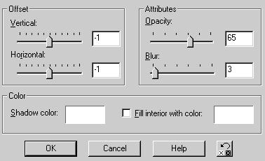
6. Make sure you are still working on the white inset layer and click Effects>3D Effects>CUTOUT. (The Cutout effect is similar to a drop shadow, but the "shadow" is placed on the INSIDE of a selection.)
View my settings below. Make sure you choose (negative) -1 for both the vertical and horizontal offset. Choose WHITE for the shadow color and do not check the fill interior setting. Depending on the size of your font, you might have to adjust the Opacity or Blur slightly.
7. It might be hard to view our text with the selection marquee, so let's hide that for now so we can see what we are creating. Click Selections>HIDE. (This is a great feature of PSP, but just remember later on, to UNHIDE your marquee or you might forget that the selection is even there.) Even though the selection marquee is hidden, it is still active.
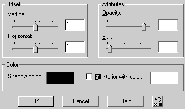
8. Now activate the black inset layer by clicking on it in the layer palette. Let's add another Cutout Effect. Here are my settings below. Notice that the vertical and horizontal are now a positive 1 - the shadow color is BLACK and Opacity and Blur are slightly different. Again, you might have to experiment if your font shape or size is different than mine.
9. Do you feel your inset text looks good at this point?? If you love it, great! Save and move onto step 11.
10. If you feel something doesn't look quite right? First make sure that the white inset layer is on the top and that is the layer that has the white cutout. The black cutout should be on a separate layer underneath it.
Still not right? let's try experimenting with your background fill. FIRST and most important, let's save your selection. Click Selections>Save to ALPHA CHANNEL - leave the default settings and click OK, then OK again. Your selection is saved to a "little space" in the psp file so you can activate it again if you need it.
After the selection is saved, click Selections>SELECT NONE. Activate the bg1 layer. If your background pattern is too light, dark or busy, change the fill to an alternate pattern or color.
To re-adjust the cutout settings, just click Selections>Load from Alpha Channel and choose the selection from the menu. Viola, the marquee is back to the exact position. (Make sure you UNHIDE the marquee to view it.) Then click on the black or white inset layer and choose the cutout effect again. PSP only remembers the last settings, not the last setting for that layer. If any errors are made, use Edit>UNDO.
11. If you are ready to move on, Unhide your selection marquee and click Selections>SELECT NONE.
On the layer palette, hide the bg1 layer. Click on one of the remaining layers, and choose Layers>Merge>MERGE VISIBLE. This merges all non-hidden layers into one layer named "Merged" - you can now optionally rename the layer to "text." You should now have only two layers on the palette.
Now that the cutout text has been merged into one, you can reposition it easily on the canvas. Use the Mover tool, and be careful you don't move the background fill in error. If you make a mistake, click Edit>UNDO. Move the text so it is centered in the middle of your canvas.
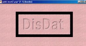
12. At this point, your image can be used as is. Just crop off the excess canvas, save and export as .jpg (or .gif.)
If you want to move onward, let's create a rectangular shape selection and apply the same effect.
13. Create a new layer named border. Move it to the top of the layer palette.
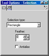
14. Make sure you are working on this new layer. Click the Selection
Tool ![]() ,
and on the Tool Options palette, choose Type: rectangle, Feather: 0 and UNcheck
anti-alias.
,
and on the Tool Options palette, choose Type: rectangle, Feather: 0 and UNcheck
anti-alias.
Click and drag a rectangle selection shape around your text. The marquee should be at least 25 - 30 pixels away from the text.
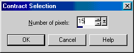
15. Fill the selection with BLACK then click Selections>Modify>CONTRACT by 15 pixels. The marquee size is reduced by 15 pixels.
16. Click the DELETE key on your keyboard or Edit>CLEAR to remove the black from the marquee. This will leave a black frame around your text.
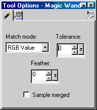
17. We are almost there! Using the Selection Magic Wand ![]() ,
click once on the black frame. The whole frame should be selected. If you
have any problems, check the tool options settings, and they should be similar
to mine.
,
click once on the black frame. The whole frame should be selected. If you
have any problems, check the tool options settings, and they should be similar
to mine.
18. Click the DELETE key or Edit>CLEAR to remove the black color. You are left with just a selection marquee frame around your text.
19. Create a new layer named border2. On each border layer, apply the same cutout effects that you applied to the text. See steps #6 and #8 for the settings. On the layer palette, the WHITE cutout layer should be on the top of the BLACK cutout layer.
20. Optionally, to crop closely to the selection, (while the marquee is still active) click Image>CROP TO SELECTION and your canvas is neatly cropped. You can also crop by hand.

And that is it! I hope you enjoy creating inset text! Good luck!
Thanks for your support!
debbieT
Learn (x)HTML & CSS ~ Paint Shop Pro Tutorials ~ Contact debbieT ~ Beginners ~ Free Backgrounds ~ Home